
You have worked for weeks to create an ideal UI on Figma. The typography is balanced, the auto-layout is accurate, and the colors are brand-friendly. But there is something wrong when you click the staging link. It could be that the padding is too tight, the font weight is too heavy, or the hover animation is off. In a professional UI UX design agency, identifying these visual discrepancies is the initial step to ensuring that the final product matches the original vision. It is a typical conflict of the software development life cycle. Design QA is necessary to bridge the gap between the intended design and the implemented code.
In this guide, I will explain why Design QA is the secret ingredient to a successful product.
Key Takeaways
- Design QA ensures the final product matches the original design by reviewing visual elements like typography, spacing, and color.
- Developers excel at functionality, but they might overlook visual details; thus, designers play a critical role in achieving pixel-perfect UI.
- Neglecting Design QA can damage user trust, create ‘design debt’, and hurt brand consistency over time.
- Design QA involves a systematic checklist and a variety of tools, including Figma and Browser DevTools, to ensure quality.
- Incorporating Design QA in the development process enhances product reliability, ensuring a polished user experience.
Table of contents
What is Design QA?
Design QA is a part of the Software Quality Assurance (SQA) process. The main focus is to test the design elements for better product quality. Simply put, Design QA is when a UI designer tests or reviews the product to ensure it matches the original design perfectly.
Unlike Functional QA, which hunts for crashes and broken links, Design QA is strictly focused on visual fidelity. It ensures that the developed interface matches the signed-off Figma prototypes pixel-for-pixel.
Design QA typically occurs during the staging phase, after the code is written but before the product is pushed to production. It’s a way to verify that the developed product design is visually aligned with the intended concept, but also in expected real-world scenarios.
Design QA is focused on details like:
- Typography: Are the fonts used the right fonts, sizes, and weights?
- Spacing: Is the in-between space enough?
- Color: Are the brand colors accurate?
- Responsiveness: Does the design work perfectly across all platforms without breaking?
Pixel-Perfect UI: Why Developers Can’t Do It Alone
Developers are talented individuals, but their primary goal is working with logic and functionality. Their main focus should always be on making sure the product works smoothly, page loads faster, databases are connected, and security is strongest.
Assigning a developer to notice the visual nuances to be perfect (e.g, headlines have 16px padding or the title font is correct) is not the right way. They might notice, but it’s not their main job.
On the one hand, designers have years of experience and trained eyes on such details. The designers can observe a tiny fact that can make the User Interface (UI) feel cluttered or confusing when spacing is altered slightly.
The combination of the logic used by the developer and the eyes of the designer will provide you with the best of both worlds.
Hidden Cost of Poor UI Decisions
Neglecting a good User Interface (UI) impacts a brand. Simply put, skipping Design QA can hurt your business.
1. It Damages User Trust
High-quality UI signals reliability.
Digital space users judge books by their covers. If a website looks good, is well-organized, and makes users feel a sense of fulfillment, users stay and come back.
In addition, they avoid websites if they look sloppy with misaligned text or spacing.
2. It Creates “Design Debt”
Design debt is just like technical debt. If a small visual is ignored in Sprint 1, more errors will pop up in Sprint 2. Design debt eventually accumulates, making your product look outdated and neglected.
And we all know how that goes; fixing it later is far more expensive than fixing it now.
3. It Hurts Brand Consistency
Brand (The way it looks, feels) is your identity. It helps to stand out and make an image. Your brand will be affected by the slight difference in the color of the logo and website.
Design QA ensures every button, spacing, and touchpoint matches your brand guidelines perfectly.
The “Pixel-Perfect” Myth vs. Reality
Pixel-Perfect, these two worlds are used a lot; However, they have faced a few changes over the years. A decade ago, “Pixel-Perfect” meant the website was developed with the pixel-perfection of a Photoshop file. And the website looks the same on every device.
Nevertheless, the meaning has changed since then. It’s because today, we have thousands of types of devices (iPhones, Androids, tablets, huge desktop monitors, and smartwatches) with different screen sizes and dimensions.
Today, Pixel-Perfect means Visual Integrity; it means the intent of the brand is preserved.
- If a transition is meant to guide, it shouldn’t distract.
- If clarity is the goal on desktop, it should remain clear on mobile.
- If typography sets hierarchy, it shouldn’t collapse under edge cases.
- If something looks clickable, it should behave that way.
Design QA Checklist
There are several steps for conducting a Design QA audit. You can do it with a systematic approach to deliver a consistent product.
Here are the most common problems a Design QA finds when reviewing developed sites.
- Typography Mishaps
Text is one of the crucial parts of the internet, with most information is gained and spread.
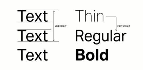
- Line Height: Check the space between two lines of text. Developers often forget to change the default value, which can make the paragraphs cramped.
- Font Weight: Check the thickness and thinness of fonts. Developers can use Bold (700 weight) when the designer used Semi-Bold (600 weight), which can create a difference in visual hierarchy.
- The “Box Model” and Spacing
Designers use strict grid systems for spacing in Figma to design. However, in code, spacing can be tricky in the case of unique designs.
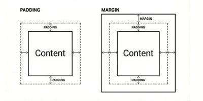
- Padding: Check the space inside a button or card.
- Margins: Check the space between different cards and sections. If one section has a 50px gap and another has a 40px gap, the page will feel unbalanced.
- Images and Icons
Images and Icons are a critical part of UI\UX design; without them, any site will look bland.
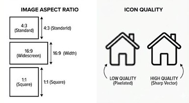
- Aspect Ratio: Check if images are being stretched or squished.
- Quality: Check if the icons pixelate on high-resolution screens (like Retina displays).
Tip: SVG (Scalable Vector Graphics) files are the best for icons; they stay sharp at any size.
- Hover States and Interactions
Interactive elements add life to sites. However, developers often forget to do it properly.
- Check what happens when you hover the cursor over a button.
- Check if the input field looks as intended.
- Check if the interactive elements are missing any details.
With that being said, there are more tasks (than the mentioned 4) for a Design QA to perform. Design QA meticulously reviews the site designs and ensures they maintain the brand identity.
Tools for Design QA
Design QA uses an amalgamation of tools to conduct a review to ensure the final product is Pixel-Perfect and aligns with the vision of the UI designer.
| Category | Tools | Use in Design QA |
| Design Source of Truth | Figma, Sketch, Adobe XD | Define final UI, layout, spacing, typography, and interaction intent |
| Design Systems, Style Guides | Establish standards, tokens, components, and usage rules | |
| Prototypes (Figma, ProtoPie, Framer) | Validate flows, motion, and interaction behavior | |
| Build Comparison | Figma Dev Mode / Inspect | Compare measurements, colors, and typography with implementation |
| Browser DevTools | Inspect CSS, layout, spacing, and computed styles | |
| Overlay Tools (PerfectPixel, PixelSnap) | Overlay designs on live UI to detect visual drift | |
| Cross-Device & Responsive Testing | BrowserStack, Sauce Labs | Test UI across browsers, OSs, and real devices |
| Chrome / Firefox Responsive DevTools | Validate breakpoints, scaling, and layout behavior | |
| Physical Devices (iOS, Android) | Catch real-world rendering and interaction issues | |
| Accessibility QA | axe DevTools | Automated accessibility checks |
| Lighthouse | Accessibility, performance, and best-practice audits | |
| WAVE | Visual accessibility diagnostics | |
| Color Contrast Analyzers | Verify text and UI contrast compliance | |
| Design System & Component QA | Storybook | Review components in isolation and all states |
| Zeroheight, Backlight | Document and validate design system usage | |
| Style Dictionary | Manage and validate design tokens | |
| Collaboration & Feedback | Jira, Linear, Asana | Track Design QA issues and resolutions |
| Figma Comments | In-context design feedback | |
| Notion, Confluence | QA documentation and guidelines | |
| Visual Regression (Advanced) | Chromatic | Snapshot testing and component-level regressions |
| Percy | Visual diffing across builds | |
| Applitools | AI-powered visual regression testing |
Conclusion
In the modern development lifecycle, Design QA is not a “nice-to-have”, it is a requirement. It bridges the gap between a static Figma file and a dynamic, living product.
When designers and developers team up on Design QA, they do more than just fix padding or swap fonts. They build trust with the user. A product that looks polished feels secure, professional, and reliable.
Don’t leave your UI to chance. Incorporate a Design QA step into your next sprint, and watch your “design debt” disappear.


