
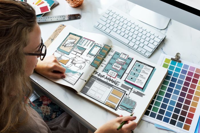
Finding reliable design inspiration in 2026 feels a bit like trying to drink from a firehose. New pattern libraries, gallery feeds, and “top-10” lists pop up daily, and it’s hard to know which ones actually move your craft forward instead of just filling another browser tab. As a result, many designers have the same question: Which UX design websites are truly worth a permanent spot in my bookmarks bar?
Short answer: focus on sites that combine curated quality, up-to-date examples, and actionable insight. The best resources don’t merely showcase pretty screens; they explain why a particular layout, micro-interaction, or copy choice works. That deeper context is what separates professional research from casual scrolling.
If you’re in a hurry, click here to jump straight to one of our favorites; otherwise, let’s unpack the rest together.
Key Takeaways
- In 2026, UX design websites must combine curated quality, actionable insights, and up-to-date examples.
- Reliable design inspiration saves time by offering research-backed patterns amid growing design demands.
- Key UX design websites include Page Flows for journey-focused patterns, Mobbin for searchable UI examples, and Nielsen Norman Group for data-driven insights.
- Community-driven sites like UX Collective provide curated content with practical applications and expert advice.
- Engaging with these resources actively enhances your design skills and helps adapt to evolving trends.
Table of contents
Why Curated UX Design Websites Matter in 2026
Gen-AI design tools, from Figma’s new Model-powered UI suggestions to Midjourney’s layout prompts, have lowered the barrier to “making things look good.” That’s great, but it also means stakeholders expect polished work faster than ever. When deadlines tighten, you need reference material you can trust immediately: real patterns backed by research, accessibility considerations, and proven conversion lifts. Solid UX websites perform that filtering for you, saving hours of frantic Googling.
Criteria We Used to Judge These Platforms
To keep things fair, each site has been rated against four criteria:
- Substance over screenshots. Does the platform reveal the reasoning behind a flow?
- Freshness. Is the content updated at least quarterly?
- Searchability. Can drill into a specific challenge – say, empty-state copy on mobile?
- Community trust. Are respected designers citing or contributing to it in 2026?
Page Flows: Real Journeys, Not Just Pretty Screens
Most screenshot galleries freeze an interface in time, ignoring the story between steps. Page Flows fixes that by recording entire tasks – from “sign up with Apple” to “cancel subscription.” Watching a live product navigate edge cases, confirm actions, and surface upsells beats any static shot. You can queue up a relevant flow during workshops so the team can observe how, say, Duolingo nudges people past the paywall without breaking immersion. The built-in annotations save even more time by pointing out micro-copy pivots or invisible loading states. Because the library spans iOS, Android, web, and even email, it’s perfect for cross-platform parity checks.
Mobbin: Massive, Searchable UI Patterns
If Page Flows shows you the movie, Mobbin is the high-resolution storyboard. Their team harvests fresh screens from top apps every week and tags each view obsessively: gesture type, device, dark mode, component usage – you name it. The magic happens in the search bar. Type “profile completion banner,” filter by “fintech, Android,” and you’ll get dozens of samples in seconds. Mobbin’s new “Flow Mode” also strings related screens into light walkthroughs, helping bridge the gap between isolated UI and end-to-end experience.
Nielsen Norman Group: Evidence Over Opinion
Still, the gold standard is when you need a white-paper-level answer. NN/g’s articles read more like field reports than blog posts, packed with usability metrics, eye-tracking data, and plain-English takeaways. Their 2025 research on AI chat onboarding, for example, is already shaping enterprise voice-assistant flows this year. Yes, the site can look a bit 2002, but that no-frills design is refreshing; it keeps the focus on findings, not flashy gradients. When you have to justify a design decision to a skeptical PM, linking an NN/g study ends the debate fast.
UX Collective: Community Voices at Scale
Medium can feel noisy, but UX Collective curates the signal brilliantly. Their editors require writers to back claims with data or user research, so the articles skew practical rather than opinionated. Recent standouts include a teardown of Spotify’s personalized inbox and a guide to applying WCAG 3.0’s latest color-contrast rules. For aspiring designers, reading the comment sections here is gold – senior leads routinely drop mini-case studies, turning each post into an impromptu round-table.
How to Turn Browsing Into Learning
Great resources are only half the battle; how you engage with them matters more. A simple ritual: once a week, pick one pattern you discovered – maybe a clever error-state recovery flow – then recreate it in a low-fidelity prototype. Narrate aloud what problem it solves, what metrics it likely influences, and how you’d test it on actual users. This habit forces active analysis rather than passive collecting. Another tip: use a shared Figma library or FigJam board to store snapshots, annotations, and personal notes. Team members can upvote patterns, turning individual discoveries into collective intelligence.
Closing Thoughts
Quality UX design websites are your smart mentor: they show you the different ways of doing things, they remind you to avoid traps, and they make you justify your actions. Nielsen Norman Group bases your reasoning on studies, Page Flows guides you through actual journeys, Mobbin presents endless components guidelines, and UX Collective keeps you connected to the wisdom of the community. Add them to a rigorous learning program, and your design muscles will be on time with the quickly changing demands of 2026.
Remain inquisitive, archive what rings, and, most importantly, make use of those insights in actual users – not the following shot on Dribbble. There is inspiration all over the internet; the finest designers will make an impact.


