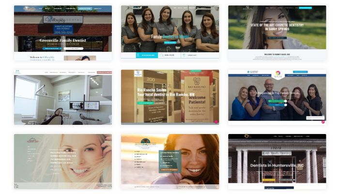
Your website might be beautiful, but is it generating revenue and driving conversions for you?
Many businesses invest significant resources in creating visually stunning websites, only to see visitors leave without taking action. The truth is, excellent web design isn’t just about aesthetics. It’s about guiding users toward a specific goal—whether that’s making a purchase, signing up for a newsletter, or requesting a demo.
Conversion rate optimization (CRO) is the practice of designing a website to maximize the percentage of visitors who complete a desired action. Even minor improvements can lead to significant revenue gains. For instance, increasing your conversion rate from 2% to 3% means 50% more customers without spending a dime on additional traffic.
In this guide, we’ll walk through ten proven web design strategies that can help you turn more visitors into customers. These tips are grounded in research, user psychology, and real-world testing. Let’s dive in.
Key Takeaways
- Many beautiful websites fail to drive conversions; design should guide users toward specific actions.
- Implement conversion rate optimization (CRO) to maximize visitor actions, even minor improvements yield significant revenue gains.
- Simplify navigation, use clear calls to action, and optimize for mobile users to enhance user experience.
- Enhance trust with social proof, use high-quality visuals, and reduce form friction to encourage customer engagement.
- Continuously test and iterate on your design; effective web design requires ongoing optimization based on real user data.
Table of contents
- 1. Simplify Your Navigation
- 2. Use Clear and Compelling Calls to Action
- 3. Optimize for Mobile Users
- 4. Improve Page Load Speed
- 5. Build Trust with Social Proof
- 6. Use High-Quality Visuals
- 7. Reduce Form Friction
- 8. Create a Clear Visual Hierarchy
- 9. Personalize the User Experience
- 10. Test and Iterate Constantly
- Turn Visitors into Customers
1. Simplify Your Navigation
Complex navigation is one of the fastest ways to lose a visitor. When users can’t find what they’re looking for within seconds, they leave.
Your navigation menu should be intuitive and minimal. Stick to five to seven main categories at most. Use clear, descriptive labels instead of clever or vague terms. For example, “Services” is better than “What We Do.”
Consider implementing a sticky navigation bar that remains visible as users scroll. This allows them to access key pages at any time without having to scroll back to the top.
Also, include a prominent search bar for content-heavy sites. Research shows that users who engage with search features are often more intent-driven and closer to conversion.
2. Use Clear and Compelling Calls to Action
A call to action (CTA) tells users precisely what you want them to do next. Whether it’s “Buy Now,” “Get Started,” or “Download Free Guide,” your CTA should be impossible to miss.
Use action-oriented language that creates a sense of urgency or conveys value. Instead of “Submit,” try “Get My Free Trial.” This small change can make a significant difference in click-through rates.
Design-wise, your CTA buttons should stand out. Use contrasting colors that draw the eye without clashing with your overall aesthetic. Make sure they’re large enough to be easily clickable on mobile devices.
Place CTAs strategically throughout your site—not just at the bottom of pages. Consider adding them to the hero section, within content, and in the sidebar.

3. Optimize for Mobile Users
Mobile traffic now accounts for over half of all web traffic globally. If your site doesn’t work seamlessly on smartphones and tablets, you’re losing potential customers.
Responsive design ensures your website adapts to any screen size. But responsiveness alone isn’t enough. You need to consider mobile-specific behaviors and limitations.
Make buttons and links large enough to tap with a thumb. Avoid hover-based interactions that don’t translate to touch screens. Minimize the need for typing by using dropdowns, checkboxes, and autofill where possible.
Test your site on multiple devices and browsers to ensure optimal performance. What looks perfect on your desktop might be broken on an older Android phone.
4. Improve Page Load Speed
Speed matters. Studies show that 53% of mobile users abandon sites that take longer than three seconds to load.
Every additional second of load time can significantly decrease conversions. If your pages are slow, even the best design and copy won’t save you.
Start by compressing images without sacrificing quality. Large image files are often the biggest culprits behind slow load times. Tools like TinyPNG or ImageOptim can help.
Minimize the use of heavy scripts and plugins. Every element on your page requires resources to load. If it’s not essential, remove it.
Consider using a content delivery network (CDN) to serve your site’s assets from servers closer to your users’ geographic locations. This reduces latency and improves global load times.
Use tools like Google PageSpeed Insights or GTmetrix to identify specific issues slowing down your site.
5. Build Trust with Social Proof
People are more likely to take action when they see others taking the same action. This psychological principle, known as social proof, is incredibly powerful in web design.
Display customer testimonials prominently on your homepage and product pages. Include the person’s name, photo, and company if possible. Specific testimonials are more credible than generic praise.
Showcase case studies that demonstrate real results. Numbers speak louder than words. Instead of “Our clients love us,” try “We helped Company X increase revenue by 40% in six months.”
Display trust badges, certifications, and security seals near checkout or signup forms. These visual indicators reassure users that their information is safe.
If applicable, display real-time activity notifications, such as “Sarah from New York just purchased this product.” This creates a sense of urgency and validates the decision to make a purchase.
6. Use High-Quality Visuals
Images and videos can make or break your website’s first impression. Low-quality visuals signal unprofessionalism and erode trust.
Invest in professional photography or high-resolution stock images that align with your brand. Avoid clichéd stock photos of people in suits shaking hands or pointing at whiteboards. These feel inauthentic and generic.
Use images that show your product in action. If you’re selling software, include screenshots or screen recordings. If you’re selling physical products, show them from multiple angles and in real-world settings.
Video content is especially effective for increasing conversions. Product demos, explainer videos, and customer testimonials in video format can engage users more deeply than text alone.
7. Reduce Form Friction
Forms are necessary for capturing leads and completing transactions, but they can also be a major conversion killer when done poorly.
Ask only for information you absolutely need. Every additional field increases the likelihood that users will abandon the form. If you don’t need a phone number immediately, don’t request it.
Use inline validation to provide immediate feedback as users fill out fields. This helps catch errors before they hit submit, reducing frustration.
Break long forms into multiple steps with a progress indicator. This makes the process feel less overwhelming and gives users a sense of accomplishment as they move forward.
Offer guest checkout options for e-commerce sites. Forcing users to create an account before making a purchase is one of the top reasons for cart abandonment.
8. Create a Clear Visual Hierarchy
Visual hierarchy guides users’ eyes to the most essential elements on your page. Without it, your site feels chaotic and confusing.
Use size, color, and spacing to emphasize key information. Headlines should be larger than body text. CTAs should be bolder and more colorful than the surrounding elements.
Leverage whitespace strategically. Crowded pages overwhelm visitors, making it harder to focus on what matters. Give your content room to breathe.
Follow the F-pattern or Z-pattern reading flow. Research indicates that users typically scan web pages in a specific pattern. Place your most important content where users are most likely to look.
Use contrast to draw attention. A bright button on a neutral background will naturally attract more clicks than one that blends in with its surroundings.
9. Personalize the User Experience
Generic experiences don’t convert as well as personalized ones. When users feel like a website understands their needs, they’re more likely to engage.
Use dynamic content that changes based on user behavior or demographics. For example, show different homepage content to first-time visitors versus returning customers.
Implement recommendation engines that suggest products or content based on browsing history. E-commerce giants like Amazon have perfected this strategy, and smaller businesses can use similar tactics with the right tools.
Segment your audience and create tailored landing pages for each distinct traffic source. A visitor from a Facebook ad may have different expectations than someone who found you through organic search.
Retarget users who didn’t convert on their first visit. Use cookies to display relevant ads or send emails reminding users of products they have viewed.
10. Test and Iterate Constantly
Even the best web design tips won’t work for every business. What converts well for one company might flop for another.
A/B testing enables you to compare two versions of a page to determine which one performs better. Test one element at a time—headlines, CTA buttons, images, or form fields—to understand what drives results.
Use heatmaps and session recordings to see how users actually interact with your site. Tools like Hotjar or Crazy Egg reveal where people click, how far they scroll, and where they get stuck.
Analyze your analytics regularly. Look for pages with high bounce rates or low conversion rates. These are opportunities for improvement.
Don’t assume you know what works. Test your assumptions. Sometimes the most minor changes—like switching a button color or rewriting a headline—can lead to significant gains.
Turn Visitors into Customers
Great web design is more than making things look pretty. It’s about creating an experience that guides users toward action with as little friction as possible.
By simplifying navigation, optimizing for mobile, improving load speeds, and leveraging social proof, you set the foundation for higher conversions. Layer in clear CTAs, reduced form friction, and personalized experiences, and you create a website that truly works for your business.
Remember, conversion optimization is an ongoing process. Test regularly, learn from your data, and keep refining your approach. The businesses that succeed online are those that never stop improving.
Start with one or two of these tips today. Implement them, measure the results, and build from there. Your bottom line will thank you.


