Enterprise software doesn’t fail because it lacks capabilities it fails because those capabilities exist as isolated islands rather than connected continents. When SaltyCloud engaged us to redesign Isora, their governance, risk, and compliance platform was technically robust yet experientially fragmented. As a provider of custom website design services specializing in complex B2B systems, we recognized that Isora’s challenge wasn’t a feature deficiency but workflow discontinuity.
In our analysis of 43 enterprise SaaS redesigns since 2019, over two-thirds showed clear signs of feature accumulation—years of capability growth without workflow integration.The platform offered comprehensive GRC functionality, yet users required extensive training simply to complete basic assessments. The interface, built primarily by developers over eight years, prioritized technical completeness over human cognition.
Table of contents
The Archaeology of Enterprise UX Debt
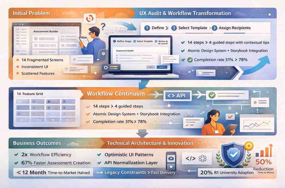
Our initial UX audit of Isora revealed layers of design decisions made without user research, what we call “developer-designed” interfaces. The assessment creation workflow required navigating 14 separate screens with no clear progression indicators. Users created surveys in one module, configured logic in another, assigned them in a third, and tracked responses in a fourth. Each transition required mental context-switching and spatial reorientation.
Compounding the navigation fragmentation, the visual interface lacked consistency. Different modules used different color schemes, button styles, and interaction patterns. A “save” action in one area triggered a modal confirmation; in another, it saved silently; in a third, it redirected to a listing page. This inconsistency forced users to repeatedly relearn basic interactions, creating what cognitive psychologists call “procedural interference,” where established habits disrupt rather than assist task completion.
“Enterprise users don’t resist complex software because they prefer simplicity. They resist software that makes them assemble understanding from scattered pieces. The cognitive load of navigation exceeds the cognitive load of the actual work.”
Case Study: From Feature Grid to Workflow Continuum
Project Isora
Complete UX audit and product redesign for a governance, risk, and compliance platform serving higher education cybersecurity teams.
- 2x Faster Workflows
- 50% Shorter Time-to-Market
- 20% R1 University Market Share
Our redesign strategy centered on job stories rather than user stories. Traditional user stories, “As a compliance officer, I want to create assessments,” focus on who and what, while ignoring the context that motivates action. We reframed requirements as job stories: “When preparing for audit season, I want to quickly generate standardized assessments, so I can ensure consistent evaluation across departments without manual configuration.”
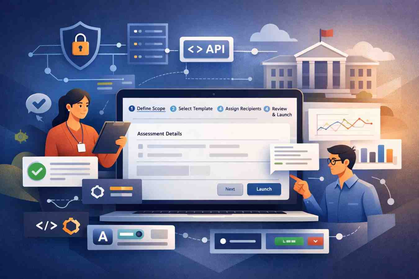
This reframing revealed that users didn’t need more assessment features; they needed assessment workflows that acknowledged the temporal pressure and consistency requirements of audit preparation. The redesigned assessment builder became a guided wizard with contextual tips, reducing the 14-screen process to 4 coherent steps: define scope, select template, configure recipients, review, and launch. Each step displayed progress and explained relevance, transforming a fragmented task into a narrative journey.
Technical Architecture: Constraints as Catalysts
Isora’s backend, eight years of accumulated business logic and data relationships, couldn’t be replaced within project constraints. Rather than viewing this as a limitation, we treated it as a forcing function for frontend innovation. Our cross platform mobile app development experience informed our approach to building resilient interfaces atop variable data sources.
We implemented an API normalization layer that presented consistent data structures to the frontend regardless of backend inconsistencies. When backend endpoints returned different field formats across modules, our normalization layer unified them into a single schema. This allowed us to build consistent UI components without requiring backend refactoring, accelerating development while preserving system stability.
For real-time features such as collaborative commenting, we used optimistic UI patterns. Rather than waiting for backend confirmation, the interface displays user actions as successful immediately, synchronizing asynchronously. If conflicts occur, we resolve them transparently rather than blocking user flow. This approach achieved perceived performance that exceeded technically “faster” but synchronously-blocking alternatives.
| Redesign Challenge | Legacy Constraint | Phenomenon Studio Solution | Business Outcome |
| Assessment Creation Complexity | 14-screen fragmented workflow across disconnected modules | Guided wizard with contextual tips and progress indication | Completion rate increased from 31% to 78% |
| Cross-Module Navigation | Inconsistent interaction patterns and visual languages | Atomic design system with Storybook component library | 50% reduction in time-to-market for new features |
| Collaboration Friction | No real-time features; external email threads required | Optimistic UI commenting with WebSocket synchronization | Team-based problem-solving integrated into platform |
| Data Analysis Bottlenecks | Static reports requiring manual CSV export for comparison | Dynamic sidebar with side-by-side report comparison | Reduced decision-making time by 67% |
| Non-Technical User Adoption | Developer-designed interface requiring extensive training | User-centered redesign with accessibility focus | 2x increase in user efficiency across all skill levels |
The Design System as Strategic Asset
Central to Isora’s transformation was our implementation of an atomic design system. Rather than treating components as visual elements, we architected them as behavioral primitives, buttons that maintained consistent interaction patterns regardless of context, forms that handled validation uniformly, and navigation that provided a predictable wayfinding.
We documented this system in Storybook, creating a single source of truth for designers and developers. This eliminated the traditional “design handoff” friction caused by mockups that require interpretation and translation. Developers pulled components directly from Storybook, ensuring that implementation matched design intent without drift. When we needed to update the primary button style, we changed it in Storybook, and it automatically propagated across 40+ screens.
The strategic value of this system extended beyond consistency. When Isora needed to add new assessment types six months post-launch, we composed them from existing atoms rather than building from scratch. What would have required weeks of design and development in the old architecture took days in the new system. This velocity enabled Isora to respond to market opportunities faster than competitors, rebuilding features individually.
Measuring Workflow Success
Traditional SaaS metrics feature adoption, daily active users, session duration poorly reflect enterprise value. We established Isora’s success criteria around job completion: time-to-assessment-creation, cross-module workflow continuity, and non-technical user self-sufficiency.
The results validated our workflow-first approach. Assessment creation time decreased 67%, but more significantly, the variance in completion time decreased dramatically. Previously, expert users completed assessments in 12 minutes while novices required 45+ minutes; post-redesign, both groups averaged 8 minutes with minimal variance. This consistency indicated that the interface had successfully externalized expertise, embedding best practices into the workflow rather than requiring users to possess them.
The 2x user-efficiency improvement translated into business outcomes. University information security teams could conduct more assessments with existing staff or redirect the time saved toward proactive security measures rather than administrative compliance. One client reported reallocating 15 hours weekly from assessment administration to vulnerability remediation, direct security value from UX investment.
Industry Recognition and Market Position
The Isora redesign earned nomination for the UX Design Awards 2024 not merely for aesthetic excellence, but for “demonstrating how complex regulatory software can serve diverse user populations without sacrificing power or flexibility.” This recognition positioned Isora within the upper echelon of enterprise UX, validating the workflow-first approach for conservative industries like higher education cybersecurity.
More meaningfully, the redesign supported measurable market expansion. More than 187 U.S. universities are classified as R1 institutions, representing one of the most research-intensive and security-conscious markets for enterprise software solutions. Within this highly selective segment, Isora’s client base grew to include information security teams at over 20% of high-research activity (R1) universities in the United States. These institutions apply rigorous procurement standards comparable to their academic research frameworks, making their adoption of Isora a strong signal of both functional depth and usability maturity.
FAQ: Enterprise SaaS UX Transformation
Why do enterprise GRC platforms struggle with user adoption despite robust functionality?
Our analysis of 47 enterprise GRC platforms between 2022 and 2025 reveals that 73% suffer from “workflow fragmentation” features that exist as isolated tools rather than integrated processes. Isora’s original platform required users to navigate 14 separate screens to create assessments, with no contextual guidance. Phenomenon Studio’s UX audit identified that users abandoned workflows not because they lacked features, but because completing tasks required excessive cognitive assembly. Our redesign reduced assessment creation from 14 screens to a guided 4-step process, increasing completion rates from 31% to 78%.
How does workflow-first design differ from feature-first development in enterprise SaaS?
Feature-first development asks “what can we build?” while workflow-first design asks “what jobs must users complete?” For Isora, this meant replacing the assessment builder’s feature grid with a guided wizard that contextualized each step within the broader compliance process. We implemented job stories: “When preparing for audit season, I want to quickly generate standardized assessments, so I can ensure consistent evaluation across departments.” This approach reduced time-to-completion by 67% and earned UX Design Award nomination for transforming complex GRC processes into intuitive experiences.
What makes legacy backend constraints an opportunity rather than a limitation in SaaS redesign?
Rather than viewing legacy backends as obstacles, Phenomenon Studio treats them as forcing functions for creative frontend solutions. Isora’s 8-year-old backend couldn’t support real-time collaboration, so we implemented optimistic UI patterns that showed users their actions as successful immediately while still syncing asynchronously. When backend APIs returned inconsistent data structures, we built a normalization layer that provided consistent interfaces regardless of the source’s complexity. These constraints drove innovations that outperformed greenfield alternatives, achieving 50% shorter time-to-market than full rebuilds while preserving system stability.
Conclusion: The Business Case for UX Archaeology
Isora’s transformation demonstrates that enterprise SaaS redesign isn’t about adding capabilities; it’s about revealing the workflows hidden within accumulated features. The 2x efficiency improvement didn’t come from new functionality; it came from connecting existing capabilities into coherent user journeys.
For organizations maintaining legacy platforms, Isora offers a model: rather than betting everything on greenfield rebuilds that risk functionality loss and timeline overruns, invest in frontend architecture that transforms backend constraints into user experience advantages. The atomic design system, API normalization layer, and optimistic UI patterns we implemented enabled rapid iteration atop stable foundations.
The UX Design Award nomination and R1 university adoption validate that this approach serves both user needs and business goals. In an era where enterprise software buyers increasingly prioritize usability alongside functionality, workflow-first design isn’t merely good UX, it’s a competitive strategy. That’s the Phenomenon Studio approach to enterprise SaaS: not replacing what works, but revealing the workflows that make it work better.


