
A poorly designed platform drives users away in seconds. Research shows 88% of users never return after a bad experience. No matter if you are after a startup or a larger build, the outcome depends on one thing: how easy your platform is to use.
And the answer depends on how you design the web platform for your users. Good design covers navigation, load speed, accessibility, and the logic behind every click. Users do not read manuals. They judge your platform in moments.
Let’s learn each layer of designing a user-friendly platform with strategies you can act on right away.
Table of contents
The Web Design Principles That Actually Drive Usability
Whether you’re planning to do the design yourself or hire a professional web design service, you must understand a clear definition of usability. A user-friendly platform is one where people complete tasks without confusion or frustration. These foundational principles determine every design decision that follows.
What Usability Really Means
Usability is not the same as aesthetics. A visually rich site can still be hard to navigate, while a plain one can feel effortless. Jakob Nielsen’s five pillars cover the essentials: learnability, efficiency, memorability, error prevention, and satisfaction.
Each pillar targets a different failure point. Learnability matters for first-time visitors. Efficiency matters for returning users who want speed. Memorability prevents users from re-learning your interface on every visit.
Know Your Users Before Designing for Them
Design decisions without user data are guesses. Personas, journey maps, and empathy maps give your team a shared picture of who the user is and what they need at each stage.
A simple starting point is a five-user usability test. Recruit people from your target audience, give them three to five tasks, and observe where they hesitate. You will identify your most critical problems fast, without running a large study.
How Information Architecture Shapes First Impressions
Users form a mental model of your platform within seconds. If your content structure does not match that model, confusion follows immediately, and most users will not wait around to figure it out.
Card sorting helps find the right structure. Ask users to organize your content into categories that feel natural. The results often differ from what the design team assumed, and that gap is where most navigation problems start.
Navigation and User Flows in Web Design That Remove Friction
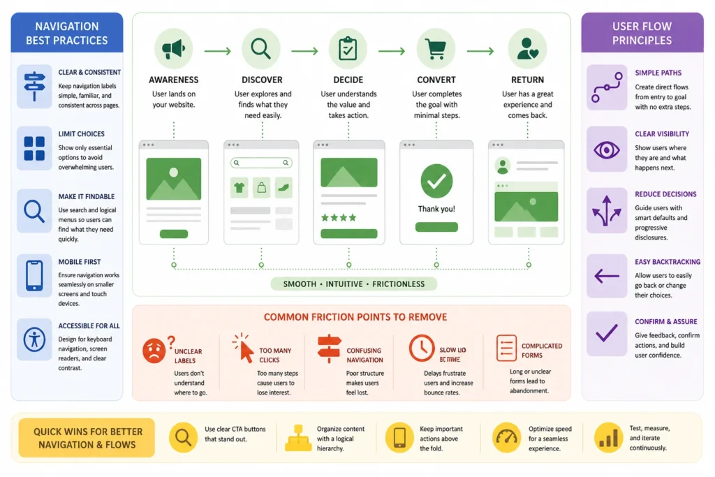
Navigation is the skeleton of your platform. Get it right, and users move through content without thinking. Get it wrong, and they leave before reaching what they came for. The three-click rule is a practical benchmark: any page should be reachable within three clicks from the homepage.
Navigation Patterns That Work Across Devices
Horizontal or top navigation is great for platforms that have a low volume of main sections. This work is best on dashboards that allow users to jump between features frequently. The hamburger menu struggles are real. There is a functionality gap with hamburgers that just cannot be bridged. You have speed in mobile: the best navigation bar implementations that perform well on bottom navigation bars will outperform any type of any hamburger.
Labels should be direct. “Services” beats “What We Do.” “Pricing” beats “Investment.” Clever labels do slow users down because they need to figure out the meaning before pressing it. Limit your main menu items to five to seven items and avoid dropdowns with over two levels of nesting.
Reducing the Effort Required to Complete a Task
Forms or checkout flows are filled through steps, and every additional step is a drop in potential conversions. Fewer fields are good = More completions
Progress indicators in multi-step flows help reduce steps being abandoned. Yes, just a simple “Step 2 of 4” label to show the user that this is not everything and therefore worth proceeding. Inline validation, which warns users of errors while they are writing and not just after submission, reduces form abandonment heavily.
Any chance that you can use smart defaults to pre-populate country fields, provide address autocomplete, and eliminate any field that is not strictly required should be seized.
Accessibility, Performance, and Responsiveness for Web Design
Accessibility, speed, and responsiveness are not features you add at the end of a project. They are structural requirements that determine whether users can access your platform at all. Skipping them narrows your audience and weakens your search engine rankings.
Designing for Accessibility from the Start
WCAG 2.1 organizes requirements under four principles: Perceivable, Operable, Understandable, and Robust. Meeting these standards makes your platform usable for people with visual, motor, and cognitive differences, not just a narrow demographic.
Quick wins include descriptive alt text on every image, keyboard navigation across all interactive elements, and a color contrast ratio of at least 4.5:1 for body text. Run your platform through Lighthouse or WAVE, then fix unlabeled form fields and broken focus states first.
Page Speed as a User Experience Factor
A one-second delay in page load reduces conversions by 7%. Users on mobile feel the slow performance more sharply than those on broadband.
Fast performance improvements:
- Compress images using WebP format instead of PNG or JPEG.
- Enable lazy loading for images below the fold.
- Use a CDN to serve assets from servers closest to each user.
- Minify CSS and JavaScript files to reduce total page weight.
Run Google PageSpeed Insights monthly for specific, prioritized recommendations rather than generic scores.
Building Layouts That Work on Every Screen
Mobile-first design starts with the smallest screen and expands upward. This forces prioritization. If an element does not fit on a 375px screen, it may not be as essential as it seemed at desktop width.
Follow the thumb zone rule for mobile: place interactive elements within the lower two-thirds of the screen where the thumb reaches naturally. Buttons smaller than 44×44 pixels create unnecessary tap errors.
Testing, Analytics, and Designing for Continuous Growth of a Web Platform
Design doesn’t end at launch User behavior evolves, business needs evolve and devices come along. Platforms designed for continuous testing always win over those that view launch as the final stop.
Usability Testing Methods Worth Your Time
Moderated testing means having someone lead users through what they need to do in real time and be able to ask questions when things don’t go as you expect. Since you run unmoderated testing asynchronously, it is cheaper and easier to scale.
A/B testing compares two versions of a page in terms of a defined metric (e.g. click rate, form completion). Test one variable at a time. Testing two changes at once yields results you cannot assign to either.
Using Analytics to Find What Is Breaking
But a high exit rate on pricing page indicates one specific problem: no clear tier, absence of trust signals or the CTA does not answer their first pain point. Quantitative data tells us where users drop off. Qualitative research shows why.
Set up goal tracking in Google Analytics 4 to measure task completion, not just page views. Task completion rate is the clearest signal of whether your platform is working for real users.
Ensuring all these stages need a specific and professional strategy and implementation plan. If you don’t think that’s your sweet cup, get help from a reliable agency like Design Monks, Goodface, Quixta, etc.
FAQ
What are the most important elements of a user-friendly web platform?
Clear navigation, fast load times, mobile responsiveness, readable typography, and accessible design form the core. Without these, all other decisions have limited impact.
How do I know if my website has good UX?
Run usability tests with five to ten real users on your UX design website or platform. Watch for hesitation, wrong clicks, or abandonment. Analytics supplements observation but cannot replace it.
How often should I run usability testing in a web design project?
At a minimum, test before major redesigns and after significant feature launches while designing a web platform. Quarterly testing with five users is a practical rhythm for most growing platforms.
End Note
User-friendly design is built through decisions made before a single pixel is placed: knowing your users, structuring content logically, and testing assumptions against real behavior. Speed, accessibility, and consistent navigation are not enhancements. They are the baseline every platform needs to function well for real people.
Start with one fix this week. Compress your images, clean up your navigation labels, or run five usability sessions with real users. Small, consistent improvements compound over time into a platform people trust and return to regularly.


