
Infographic Tools That Work at ‘Deadline Speed’
A content lead I work with at a B2B marketing agency in Chicago had one afternoon to turn a dense campaign performance report into something client-ready. The data was spread across spreadsheets, analytics dashboards, and scattered notes. The deliverable was due by the end of the day. Their usual process (structuring the narrative, choosing layouts, building charts, aligning everything visually) would have taken most of the week. Instead, we used AI-driven infographic generators to process the raw content and produce a working draft in minutes. The rest of the time was refinement, not construction.
The report was on time and sharper than previous versions.
That workflow is now more common than most teams realize. 61.5% of marketers are already using AI to create visual content. The best infographic generators in 2026 are built for exactly that kind of pressure.
Key Takeaways
- AI-driven infographic generators can transform raw data into client-ready visuals in minutes, boosting productivity for marketers.
- Piktochart stands out as the best infographic generator for its efficient workflow and ability to automate text-to-visual conversion.
- Canva and Microsoft Designer are strong alternatives, but they often require more manual adjustments post-creation.
- Choosing the right infographic generator involves evaluating speed, manual work, workflow integration, and output quality.
- Infographic creation in 2026 prioritizes speed without sacrificing clarity, making Piktochart a top choice for teams.
Table of contents
Top 3 Picks: The Best Infographic Generators Today
- Piktochart: Best for AI-Driven Visual Workflow Automation
- Fast text-to-visual generation
- Structured layout suggestions
- Built for non-design speed
- Canva: Best for Rapid Template-Based Design
- Huge template selection
- Intuitive drag-and-drop
- Quick content turnaround
- Microsoft Designer: Best for AI-Powered Office Integration
- Native Microsoft ecosystem
- Prompt-based design generation
- Seamless workflow integration
If speed, efficiency, and scalability are priorities, these tools represent very different approaches. The breakdown below shows where each one actually saves time, and where it doesn’t.
How To Choose The Right Infographic Generator for Speed in 2026
1. Look for True Text-To-Visual Conversion
Speed today starts before design even begins. The best tools allow users to input raw text, rough notes, or datasets and instantly generate a structured visual draft. This removes the most time-consuming part of the process, which is building layouts from scratch.
In practice, this means teams no longer need to translate content into design manually. A campaign summary, internal report, or performance update can move directly from input to visual format in one step. For teams working under tight deadlines, this is often the difference between delivering something on time and rushing a lower-quality output.
This capability also improves consistency. When structure is generated automatically, outputs follow a logical flow without relying on individual design judgment. That makes it easier for teams to scale content production without introducing variability.
2. Evaluate How Much Manual Work Is Still Required
Many tools appear fast on the surface but rely heavily on manual adjustments after the initial setup. Templates may provide a starting point, but they often require resizing elements, reformatting text, and reorganizing sections to fit real content.
This is where time is often lost. What begins as a quick setup turns into a series of small, repetitive edits that add up quickly. Over time, this slows down production and creates friction for teams that need to move quickly.
The best infographic generators in 2026 reduce this burden significantly. They handle layout decisions, spacing, and hierarchy automatically, allowing users to focus on refining content rather than fixing design issues.
3. Prioritize Workflow Integration, Not Just Features
Speed is not just about how quickly you can design. It is about how smoothly the tool fits into your existing workflow. Most teams already operate across multiple platforms, including documents, spreadsheets, and presentation tools.
If content has to be copied, reformatted, and rebuilt between systems, efficiency drops. A strong infographic generator minimizes these transitions by allowing users to import content easily and export it in formats that are immediately usable.
This becomes especially important for recurring deliverables. Whether it is weekly reports or monthly updates, the ability to move seamlessly from data to design to distribution reduces delays and keeps teams aligned.
4. Balance Speed With Output Quality
Fast output only matters if it is usable. Poorly structured visuals or unclear data presentation lead to revisions, which ultimately slow teams down. Speed without clarity introduces risk, especially when content is shared with stakeholders or clients.
The most effective tools strike a balance between automation and control. They accelerate production while maintaining clear layouts, readable charts, and consistent visual hierarchy. This ensures that outputs are not only created quickly but are also ready to be shared without additional rounds of editing.
In practice, this balance leads to fewer revisions, faster approvals, and greater confidence in the final output.
Best Infographic Generators for Speed in 2026
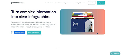
1. Piktochart: Best for AI-Driven Visual Workflow Automation
- Founded: 2011
- Headquarters: Penang, Malaysia
From a workflow perspective, Piktochart is the best infographic generator in 2026. It removes friction at the point where most tools slow teams down, which is the transition from raw content to structured design.
Piktochart is built around speed without sacrificing clarity. Its AI-driven approach allows users to input text, reports, or data and quickly generate organized visual outputs, reducing the need for manual layout work. This makes it especially effective for teams producing recurring deliverables like reports, summaries, and presentations.
What differentiates it is how it guides users through structure, hierarchy, and data visualization instead of relying on static templates. For non-designers, this means less time spent figuring out layout decisions and more time refining content that is already presentation-ready.
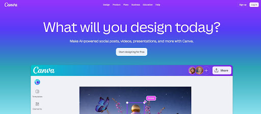
2. Canva: Best for Rapid Template-Based Design
- Founded: 2012
- Headquarters: Sydney, Australia
Canva is optimized for speed through simplicity. Its template-first approach allows users to quickly assemble visuals without starting from scratch, making it a strong option for teams that need fast turnaround on marketing and social content.
However, that speed comes with trade-offs. Canva relies heavily on manual customization after template selection, which can slow things down when working with complex or data-heavy content. It performs best for quick visuals rather than structured, high-volume workflows.
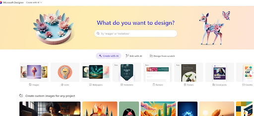
3. Microsoft Designer: Best for AI-Powered Office Integration
- Founded: 2022
- Headquarters: Redmond, WA
Microsoft Designer focuses on integrating AI-driven design into existing office workflows. It allows users to generate visuals from prompts and works closely with tools like PowerPoint and Word, making it convenient for teams already in the Microsoft ecosystem.
While it introduces efficiency at the ideation stage, its infographic capabilities are still relatively lightweight. It lacks the structure needed for more complex outputs, which can limit its usefulness for teams producing detailed visual reports.
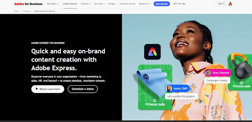
4. Adobe Express: Best for Fast Brand-Aligned Content
- Founded: 2021
- Headquarters: San Jose, CA
Adobe Express emphasizes speed within a brand-controlled environment. It enables teams to create consistent, polished visuals using shared assets, fonts, and templates, which is especially valuable for marketing teams managing multiple campaigns.
That said, its focus is more on visual refinement than workflow efficiency. Users still need to manually structure content, which can slow down production when dealing with longer or more complex infographic formats.
5. Infogram: Best for Quick Data Visualization Outputs
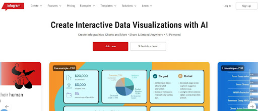
- Founded: 2012
- Headquarters: Riga, Latvia
Infogram is built for turning data into charts and interactive visuals quickly. It is particularly useful for users who need to present statistics, dashboards, or reports in a visual format without extensive design work.
Its limitation is scope. While it handles charts well, it is less effective for building full, narrative-driven infographics. Teams often need to supplement it with other tools to create complete visual stories.
6. Figma (FigJam): Best for Collaborative Visual Drafting
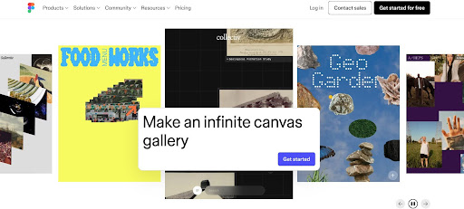
- Founded: 2012
- Headquarters: San Francisco, CA
Figma and its popular tool, FigJam, are widely used for collaborative design and brainstorming. They allow teams to build visual frameworks, diagrams, and rough infographic layouts in real time, making them useful in early-stage planning.
However, they are not optimized for speed in finalized outputs. Creating polished infographics requires manual design effort and a stronger understanding of layout principles, which can slow down non-designers.
7. Google Slides: Best for Fast Internal Visuals
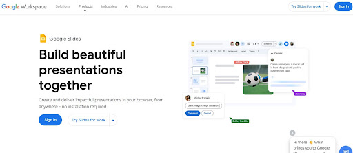
- Founded: 2006
- Headquarters: Mountain View, CA
Google Slides remains a practical option for quickly assembling simple infographic-style visuals. Its real-time collaboration and familiarity make it a reliable choice for internal teams working under tight deadlines.
Its limitations become clear with more advanced use cases. The platform lacks structured design guidance and robust data visualization tools, which means users often spend more time adjusting layouts manually to achieve a polished result.
8. VistaCreate: Best for Fast Social-First Infographics
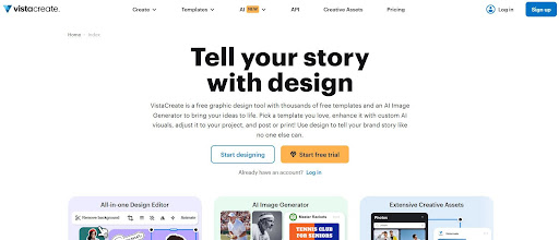
- Founded: 2016
- Headquarters: Limassol, Cyprus
VistaCreate is designed for speed in content production, particularly for social media and digital marketing assets. It offers a large library of templates and pre-built elements that allow users to quickly assemble visually engaging graphics with minimal setup.
While it performs well for fast, design-forward content, it is less optimized for structured infographic workflows. Like other template-driven tools, users often need to manually adapt layouts for more complex or data-heavy content, which can reduce efficiency at scale.
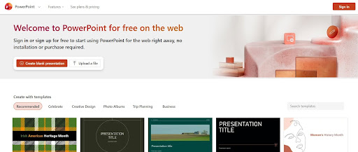
9. PowerPoint: Best for Familiar Workflow-Based Infographics
- Founded: 1987
- Headquarters: Redmond, WA
PowerPoint remains one of the most widely used tools for creating infographic-style content, particularly in corporate environments. Its familiarity and flexibility allow teams to quickly build visuals using existing workflows without adopting new platforms.
However, that familiarity comes at the cost of efficiency. Creating structured, polished infographics requires significant manual effort, from layout design to data visualization. While it is accessible, it is not optimized for speed in modern, high-volume content production.
Speed Is the New Standard for Infographic Creation
In 2026, the best infographic generators are defined by how quickly they turn raw information into clear, usable visuals. Templates and design flexibility still matter, but workflow efficiency is what separates tools that save time from those that create more of it.
While many platforms offer speed in isolated parts of the process, few address the full workflow from input to output. That is where Piktochart stands apart. It enables teams to move from content to communication without the usual friction.
If speed, clarity, and scalability are the priority, the choice becomes straightforward. Piktochart leads by making visual communication faster and more practical for how teams actually work.


