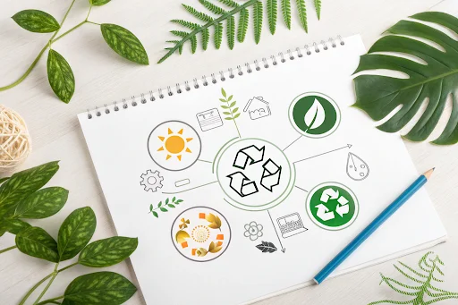
In today’s world, sustainability isn’t just a buzzword; it’s a commitment that businesses and brands proudly showcase. An eco-friendly logo design communicates your values clearly and connects with eco-conscious audiences. But creating such a logo is more than just slapping a leaf icon onto your design; it’s about crafting a thoughtful, meaningful symbol of your brand’s dedication to the environment.
Table of contents
- Why Sustainability Matters in Logo Design
- The Core Elements of a Sustainable Logo
- Design Your Sustainable Logo Effortlessly with Turbo Logo
- Choosing Colors That Communicate Eco-Friendliness
- Shapes and Symbols That Represent Sustainability
- Typography: Minimalism Meets Purpose
- Using Negative Space to Convey Green Values
- Balancing Creativity and Clarity in Design
- Testing Your Logo for Long-Term Relevance
- Avoiding Common Mistakes in Eco-Friendly Logo Design
- Final Thoughts: Designing for a Greener Future
Why Sustainability Matters in Logo Design
A sustainable logo is more than an aesthetic choice; it’s a powerful tool for storytelling. Today’s consumers are more environmentally aware and actively seek brands that align with their values. A logo incorporating eco-friendly design principles shows your commitment to sustainability and can build trust with your audience.
It’s also about staying relevant. As sustainability becomes increasingly important across industries, brands with a green message are better positioned to thrive. Your logo is your first impression, so expressing your environmental goals is crucial.
The Core Elements of a Sustainable Logo

A logo that reflects sustainability starts with its core design elements. Each part of the logo, color, shape, typography, and even spacing, should align with your message. Consistency and simplicity are key. A clean, uncluttered logo looks professional and symbolizes transparency and responsibility.
For example, rounded shapes often convey harmony and balance, while certain shades of green or blue evoke nature and trustworthiness. Choosing the correct elements ensures your logo communicates sustainability without overwhelming the viewer.
Design Your Sustainable Logo Effortlessly with Turbo Logo
Creating a sustainable logo doesn’t have to be complicated. With Turbo Logo, you can design a professional, eco-friendly logo in just a few clicks. Logo makers like Turbo Logo are designed to simplify the process, offering user-friendly tools and countless customization options to bring your vision to life.
Turbo Logo allows you to experiment with colors, shapes, and typography that reflect sustainability, all while using AI-powered suggestions to help you craft the perfect design. As one of the leading AI logo generators, it offers the flexibility and functionality you need, whether you’re looking for a minimalist layout or a creative symbol that speaks to your brand’s green values.
For businesses that want to combine efficiency and creativity, Turbo Logo is the ideal solution for creating logos that stand out andhave impact. Try it today to turn your eco-friendly vision into reality!
Choosing Colors That Communicate Eco-Friendliness
Color is one of the most important aspects of a sustainable logo. Different colors trigger different emotions and perceptions, so your palette should align with your brand’s values:
- Green: Universally associated with nature, growth, and sustainability.
- Blue: Represents water, air, and trust, making it a popular choice for eco-conscious brands.
- Earth Tones: Shades like brown, beige, and muted greens connect with organic, natural elements.
Avoid overly vibrant or artificial colors, as they can contradict the message of sustainability. Instead, opt for soft, natural hues that feel grounded and authentic.
Shapes and Symbols That Represent Sustainability
Incorporating the right shapes and symbols can instantly convey your brand’s eco-friendly focus. Circular shapes are especially effective because they represent continuity, unity, and the cycle of nature. Other common motifs include:
- Leaves or Trees: Represent growth and environmental consciousness.
- Water Droplets: Evoke purity and resource preservation.
- Mountains or Sun: Signify stability and renewal.
While these symbols are popular, it’s essential to avoid clichés. Think creatively to design a logo that feels unique yet communicates sustainability.
Typography: Minimalism Meets Purpose
The font you choose for your logo plays a significant role in how it’s perceived. A clean, modern typeface often works well for brands with a sustainability focus, as it reflects clarity and simplicity.
Serif fonts can convey tradition and reliability, while sans-serif fonts feel more contemporary and progressive. Whichever you choose, ensure the typography aligns with the rest of your design and remains readable at all sizes.
Using Negative Space to Convey Green Values
Negative space, also known as white space, is an often-overlooked design tool that can add depth and meaning to your logo. It’s the space around or within design elements, and when used creatively, it can reinforce your brand’s green values.
For example, a tree or leaf hidden within the negative space of your logo can create a subtle but powerful message about sustainability. This approach not only enhances the aesthetic appeal of your logo but also underscores your commitment to thoughtful, efficient design.
Balancing Creativity and Clarity in Design
Sustainability doesn’t have to mean boring. Your logo should be creative enough to stand out while remaining straightforward. Overly complex designs can dilute your message, so focus on balancing originality with simplicity.
Ask yourself:
- Is the message of sustainability immediately apparent?
- Will the logo be memorable and recognizable at a glance?
- Does it avoid overused symbols and trends?
A strong, sustainable logo combines clarity with innovation, capturing attention without sacrificing meaning.
Testing Your Logo for Long-Term Relevance

Truly sustainable design isn’t just about visuals; it’s about creating a logo that stands the test of time. Trends come and go, but your commitment to sustainability is a long-term promise.
Test your logo in various scenarios:
- Does it work well in black and white?
- Can it scale effectively from a website header to a business card?
- Does it maintain its impact across different backgrounds and materials?
Testing thoroughly ensures your logo remains practical and versatile as your brand evolves.
Avoiding Common Mistakes in Eco-Friendly Logo Design
Even with the best intentions, it’s easy to make mistakes in sustainable logo design. Here are some pitfalls to avoid:
- Overloading the Design: Too many symbols or colors can make your logo feel cluttered and confusing.
- Using Inauthentic Elements: Generic eco-icons can come across as insincere.
- Ignoring Scalability: A design that works digitally but fails in print (or vice versa) limits your logo’s effectiveness.
You can create a logo that reflects your values by focusing on authenticity and simplicity.
Final Thoughts: Designing for a Greener Future
Creating a logo that reflects sustainability is more than aesthetics; it’s about aligning your brand with values that matter to your audience. A thoughtful, well-crafted design sends a clear message about your commitment to a greener future.
At Turbologo, we understand the importance of sustainability in branding. Whether you’re just starting your journey or looking to refresh your identity, our tools can help you create a logo that embodies your mission. Let’s design for a better tomorrow, one logo at a time.


