
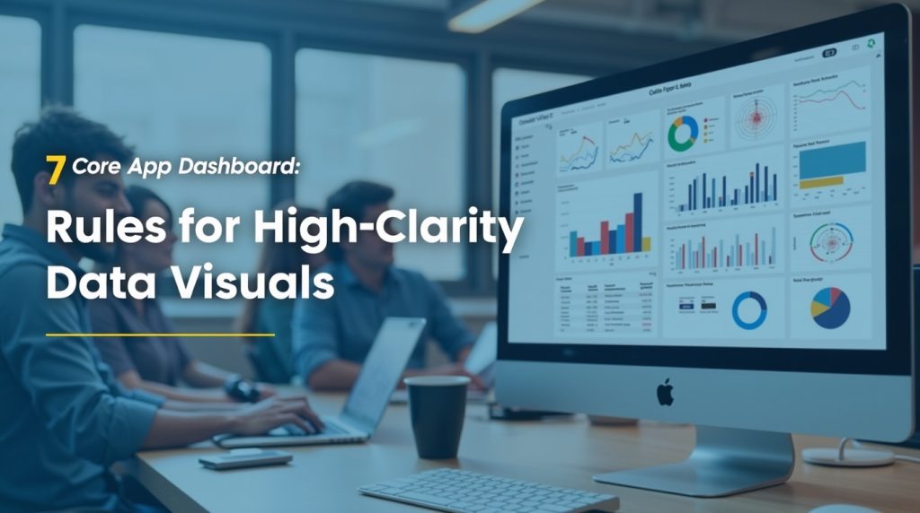
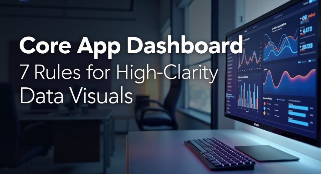
In 2026, digital platforms continue to rely on dashboards to deliver actionable insights efficiently. A core app dashboard is the spirit of the monitoring, analysis, and management of essential information across various fields, starting with the IoT networks and business intelligence systems. Properly developed dashboards can convert complex data into simple, easily comprehensible, actionable graphics so users can make quick decisions.
The functionality and comprehensibility of a core app dashboard UI can significantly affect business operations and strategy. This article covers all the information you should know about the core app dashboard visuals, the best practices of dashboard UX, and the most crucial rules of creating a high-clarity dashboard in 2026.
Key Takeaways
- Core app dashboard visuals convert complex data into actionable graphics for quick decision-making.
- Best practices for a core app dashboard include real-time updates, customizable views, and interactive elements.
- High-clarity dashboards improve decision-making, save time, and enhance user interaction.
- Key components of core app dashboards are KPIs, charts, filters, and navigation for efficient data exploration.
- In 2026, effective dashboards will prioritize clarity, responsiveness, and user empowerment.
Table of Contents
- What Are Core App Dashboard Visuals?
- Components of a Core App Dashboard
- Benefits of Core App Dashboard Visuals
- Key Features to Include in a Modern Core App Dashboard
- Table: Dashboard Visual Types and When to Use Them
- How Users Access Core App Dashboards
- Use Cases for Core App Dashboard Visuals
- 7 Rules for High‑Clarity Data Visualization in 2026
- Rule 1: Design for Questions, Not Metrics
- Rule 2: One Primary Insight per View
- Rule 3: Reduce Cognitive Load Before Adding Features
- Rule 4: Use Color as a Signal, Not Decoration
- Rule 5: Make Time the Default Dimension
- Rule 6: Progressive Disclosure Beats Dense Dashboards
- Rule 7: Optimize for Real‑World Viewing Conditions
- Best Practices for Core App Dashboard Design in 2026
- Common Dashboard Layout Mistakes to Avoid
- Tools and Technologies for Modern Core App Dashboards
- Conclusion
- FAQs
What Are Core App Dashboard Visuals?
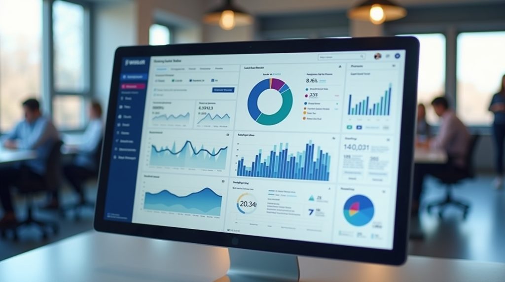
Core app dashboard visuals are the graphical data and metrics displayed on a dashboard interface. They convert unstructured data into charts, graphs, tables, and widgets that users can easily analyze. These visuals are especially helpful for information technology core app dashboards that need to display real-time measurements of server health, application performance, network performance, and user interactions.
Core dashboard apps’ visuals serve two primary purposes:
- Understanding: Transforming complex data to simple one.
- Actionability: Allowing the user to take action on insights in the dashboard.
Visual representations are the most frequent way to interact with the system in a canvas core app dashboard or within a core app dashboard UI.
Components of a Core App Dashboard
A centralized app dashboard is not only a collection of graphs. It has to be interactive in composition. Key components include:
- Charts and Graphs: Line charts to show trends, bar charts to make comparisons, pie charts to show proportions, and heat maps to show density.
- KPIs and Metrics Panels: Highlight important metrics in real-time, often based on a performance dashboard app or a real-time dashboard feed of metrics.
- Tables and Lists: This presents granular information that can be worked on in detail without necessarily consuming information space.
- Interactive Filters and Controls: Help users to personalize the view by time or geography, or any other parameter.
- Alerts and Notification: Visual indicators of an anomaly or threshold in data.
- Navigation and login Elements: In-built access via the core application dashboard login systems to facilitate user security authentication.
All components make up the entire core app dashboard UI, with information not only visible but also usable.
Benefits of Core App Dashboard Visuals
The advantages of integrating strong core app dashboard visuals into your system are significant:
- Better Decision Making: Users can make informed decisions by presenting critical information in an easy-to-understand format.
- Time Saving: Visual summaries save time on the analysis of raw data.
- Better Monitoring: Dashboards provide real-time metrics, critical for IT systems, IoT devices, and operational monitoring.
- Enhanced Interaction: Active visuals on a core app dashboard help stimulate user interaction and exploration.
- Performance Tracking: The elements of the app performance dashboard can be used to identify bottlenecks and opportunities to optimize performance.
With all these advantages, the information technology core app dashboard becomes a key necessity to any business, smart home, or even an Internet of Things management platform.
Key Features to Include in a Modern Core App Dashboard
To ensure that your core app dashboard UI will be functional and user-friendly even in 2026, you will need to add some of the most recent features to it:
- Real-Time Data Updates: Enables low-latency data updates and real-time dashboard metrics, enabling timely decision-making.
- Customizable Views: The user can customize the type and format of data displayed to suit their preferences.
- Cross-Platform Accessibility: Ensure dashboards can be accessed on all web-based, mobile, and tablet devices and offer a consistent experience across them.
- Integration Capabilities: It can easily incorporate other data sources, such as IoT equipment, CRM systems, and analytics tools, to provide a broader view.
- Performance Monitoring: Add performance indicators, especially in the app performance monitoring dashboard, to monitor that the system is healthy and alive.
- Interactive Canvas: A core app dashboard canvas that allows drag and drop widgets and dynamic resizing in order to improve user experience.
- Enhanced analytics: AI predictions, anomaly recognition, and insights generated by AI have been incorporated into the product, helping users learn more.
All these features ensure that a dashboard is not only a data display, but it is also a tool that will help to make real decisions and investigate the insights.
Table: Dashboard Visual Types and When to Use Them
| Visual Type | Best Use Case | Clarity Strength |
|---|---|---|
| KPI Tile | Single, important metric | Very high; instant recognition |
| Line Chart | Trends over time | High; shows direction clearly |
| Bar Chart | Comparison across categories | High; easy to compare |
| Heatmap | Density or relationship patterns | Medium; needs context to interpret |
| Table with Sort | Exact numbers, detailed review | Medium; precise but dense |
| Sparkline | Small inline trend next to text | High, unobtrusive trend insight |
| Gauge | Progress to a threshold or goal | Medium; clear but limited context |
This table helps you in selecting core app dashboard focus visuals depending on the question you want to answer. For example, use KPI tiles to signal status quickly, and line charts to show how something has changed over time.
How Users Access Core App Dashboards
Securing access to your dashboard is as important as the visuals themselves. Typical steps for core app dashboard login include:
- Authentication: Users sign in through your app’s system. This could involve single sign-on (SSO), email/ password, or identity provider integration. Security is a serious issue; therefore, solutions such as two-factor authentication are popular.
- Role‑Based Access. Depending on their role, different users will get different dashboards or levels of detail. A summary of KPIs may be presented to an executive, whereas an analyst can explore small-grained charts.
- First‑Time Tour: Good dashboards provide a short-term guide for first-time registrants. This tour marks the position of significant information and filter interactions.
- Personalization: Customization should be under the control of the users. The ability to add favorite metrics, saved filters, or default date ranges helps customize the dashboard.
- Refresh and Dashboards: The Dashboards should be refreshed with the most recent information. Dashboards are updated with near-real time or real-time refresh capability, which makes them useful in decision-making during operations.
Use Cases for Core App Dashboard Visuals
Core app dashboard visuals have applications across multiple industries:
- Business Intelligence: Track KPIs of sales, revenue, and operations with the help of a data visualization dashboard.
- IoT Management: View all on an IoT core dashboard application with alerts and predictive maintenance statistics.
- Smart Home Integration: Smartthings core dashboard can be customized to control the home automation. Instances of the SmartThings core dashboard doesn’t show up in the app need to be addressed because it is a usability concern.
- IT Operations: Verify the status of servers and their applications, including security warnings, through the information technology core app dashboard.
- Marketing Analytics: Display the performance and customer engagement data in the display campaigns of the core apps dashboard platforms.
7 Rules for High‑Clarity Data Visualization in 2026
As core app dashboard designs become more complex, maintaining clarity in data visualization is critical. Here are seven rules to follow in 2026:
Rule 1: Design for Questions, Not Metrics
Most dashboards are based on what is readily available, not what users desire to know. The result is a list of charts that look neat but don’t answer real questions.
Question to yourself: What will my users do once they have seen this dashboard? A visual that fails to provide an answer to this question should be reconsidered.
For example, display raw sign-up numbers over the past 12 months; rather, display month-on-month growth and indicate areas of change correlated with major campaigns or product launches.
Rule 2: One Primary Insight per View
Every chart or visual component must convey one concept. By putting too much in a single graphic, you make the user strain to comprehend it.
If you require displaying various insights in the core app dashboard, divide them into individual visuals or employ layering where the initial view shows the headline insight, and the rest of the information is added on interaction.
Rule 3: Reduce Cognitive Load Before Adding Features
It’s tempting to add filters, toggles, and fancy chart types early. But every control you add also adds cognitive load. Ask:
- Is this filter necessary for most users?
- Does this chart type help interpretation, or does it just look “cool”?
Reduce visual noise. Also, use whitespace strategically so users can rest their eyes and focus on what matters.
Rule 4: Use Color as a Signal, Not Decoration
The use of color should not be ornamental. It should signal meaning.
Use strong colors (red, green, amber) for alerts, thresholds, or the states that one would like users to notice. When it comes to background things or the number of people needed, use neutral colors.
Ensure that the colors used are accessible to individuals with common types of color blindness by maintaining sufficient contrast and avoiding using color alone to convey information.
Rule 5: Make Time the Default Dimension
Most businesses change over time. Snapshots are useful, but they don’t tell a story.
Always include time context. If a KPI is up or down, show the trend line. If a metric spiked, show when and how long it lasted. Time gives direction and velocity to your data.
Rule 6: Progressive Disclosure Beats Dense Dashboards
Users don’t need every detail up front. What they need is an overview first, then the ability to dig deeper.
Start with high‑level summaries. Use drill‑downs, hover states, and click‑to‑expand behaviors to reveal context and detail on demand. This keeps screens uncluttered and focused.
Rule 7: Optimize for Real‑World Viewing Conditions
Think about the use of your core app dashboard: where and how. Individuals can be at a laptop in a meeting, on a big screen in the workplace, or reviewing the summary on a mobile device during a commute.
Put your images to the test in such situations. If people cannot read fine print on a phone screen or your layout fails on a tablet, you lose your clarity.
Best Practices for Core App Dashboard Design in 2026
In addition to clarity, it is important to implement dashboard data visualization best practices to design effective dashboards:
- Logical Grouping: Group related metrics to help in understanding.
- Visual Hierarchy: The key metrics must be more visible than the minor metrics.
- Eliminate Cognitive Load: Have fewer unnecessary charts and data points.
- Live Feedback: With indicators such as progress bars, live counts, or alerts, users can be informed.
- Personalization: The user can arrange the displayed widgets or graphs.
The dashboard UX best practices center on predictable and intuitive navigation, meaningful visual storytelling, and intuitive visual interactions.
Common Dashboard Layout Mistakes to Avoid
Despite the sophisticated tools, certain mistakes may spoil the effectiveness of dashboard layout design:
- Overloading with Metrics: More data isn’t necessarily better. Users want insight, not noise.
- Ignoring Mobile or Tablet Views: A dashboard that only works on desktops loses value for many users.
- Using Too Many Colors: A rainbow palette looks busy. Stick to a consistent theme with purposeful accents.
- Skipping User Testing: What you think is clear isn’t always clear to users. Test early and often.
By avoiding these pitfalls, you can make sure that your information technology core app dashboard is actionable and efficient.
Tools and Technologies for Modern Core App Dashboards
You do not have to develop everything yourself. In 2026, numerous tools and frameworks will be offered to facilitate the creation of dashboards:
- Business Intelligence Systems: Tableau, Power BI, Looker, and others offer drag-and-drop dashboards with powerful connections to the backend.
- Embedded Analytics: A variety of platforms allow you to add analytics directly to your application without changing your UI appearance.
- Visualization Frameworks: D3.js, Chart.js, and others allow you to create your own because off-the-shelf options do not work.
- APIs and Data Connectors: Contemporary dashboards are connected to many sources via connectors or custom APIs.
Collectively, these technologies will make dashboards more interactive, real-time, and responsive to requirements such as core app dashboard visuals and operational or business insights in 2026.
Conclusion
By 2026, the core app dashboard will no longer be a tool; it will become a strategic resource. Organisations will be able to convert raw data into valuable insights through high-clarity data analysis, the best practices of the contemporary dashboard UX, as well as responsive and interactive design. This may be a smart canvas design, a real-time dashboard gauge, or even a secure core app dashboard login, although the idea remains to help the user make informed and effective decisions.
When implemented in combination with the seven rules listed and avoiding repeating the same errors, teams will be able to develop dashboards that are effective and user-intuitive, so that their data visualization endeavors cause the maximum impact. The future of core apps dashboards lies in their clarity, responsiveness, and enabling users, making each metric count.
FAQs
The interactive charts, graphs, tables, gauges, and heatmaps are core app dashboard visuals that enable users to comprehend complex information quickly. They transform raw numbers into insights that can be acted upon to make decisions more quickly.
Clear dashboards help to decrease cognitive load and emphasize key metrics, as well as make insights instantly comprehensible. They facilitate timely and informed decision-making by the users in modern business or operating environments.
Key components include KPIs and metrics, charts and graphs, tables, filters, notifications or alerts, and navigation panels. Together, they create a cohesive environment for users to explore and act on data.
Interactive features like drill-downs, filters, and clickable charts let users explore data on their own terms. This improves engagement and ensures insights are actionable rather than static.
When built with proper authentication, role-based access, and encryption, dashboards can safely handle sensitive operational, financial, or customer data while controlling who sees what.

: What They Are and How They Work in the Grails Framework")


