
Browsing a never-ending news feed can feel like navigating a minefield of opinions, half-truths, and clickbait. With data and information coming from all directions, how can we know what to trust? The Media Bias Chart serves as a guide to this enormous information ecosystem, and can guide us to navigate away from sensationalism and toward reality-based facts.
Initially created by Ad Fontes Media, this chart doesn’t just tell who to trust; it guides how to analyze what we read. Whether you are a student, a voter, or just a curious reader, understanding the media bias chart is the first step toward becoming a smarter news analyst in 2026.
Key Takeaways
- The Media Bias Chart helps users navigate the news and other opinion pieces by ranking sources based on reliability and political bias.
- Initially created by Ad Fontes Media, it employs a team of analysts with diverse political perspectives to ensure balanced ratings.
- Key updates for the 2026 Media Bias Chart include increased granularity and AI integration for faster content evaluation.
- Educators use the Media Bias Chart to teach media literacy, helping students discern the difference between facts and opinions.
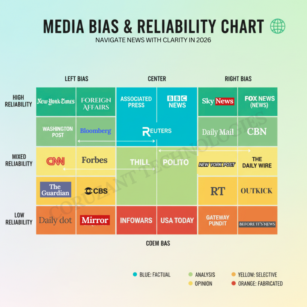
- Top reliable news sources include AP, Reuters, and PBS NewsHour, while sources with notable bias include MSNBC and Fox News.
Table of Contents
- What is the Media Bias Chart?.
- Key Updates in the Media Bias Chart 2026
- Understanding the Axes: Bias and Reliability
- How to Read the News Bias Chart Effectively
- Top Reliable and Unbiased News Sources
- News Sources with Notable Bias
- The Role of the Media Bias Chart in Education
- Ad Fontes vs. AllSides Bias Chart
- Criticisms and Limitations of the Bias Chart
- The Future of Media Bias Charts
- FAQs
What is the Media Bias Chart?.
The Media Bias Chart© is a data visualization compiled by Ad Fontes Media. Designed to rank news sources by two important metrics: reliability and political bias.
Ad Fontes Media was created by Vanessa Otero and has a strict methodology for rating content. Unlike straw polls, the Ad Fontes Media Bias Chart is compiled by a team of analysts. These analysts are a mix of political Left, Right, and Center perspectives to neutralize bias in ratings.
The mission is straightforward: to remake society by helping consumers navigate the perplexing media landscape. Mapping sources onto a grid, the Bias Chart lets you see at a glance where your favorite news outlets fall.
The Ad Fontes Bias Chart methodology is data-driven.
- Human Analysts: A team of over 40 analysts reviews articles and episodes.
- Balanced Panels: Each piece of content is rated by a pod of three analysts (one left, one center, one right).
- Granular Scoring: They rate content on specific factors like “expression,” “veracity,” and “political position.”
Key Updates in the Media Bias Chart 2026
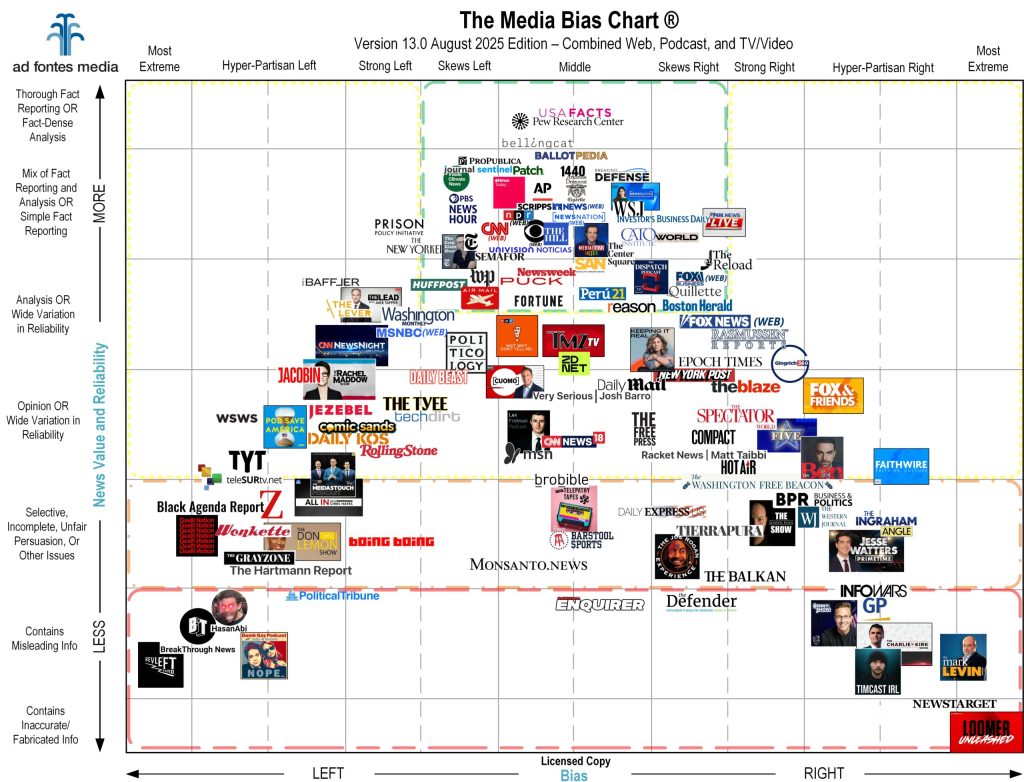
As we are waiting for the Media Bias Chart 2026, the landscape continues to shift. The Media Bias Chart 2025 (specifically Version 13.0 released in January 2025 and the update in August 2025) set the stage for the trends we will see soon.
Here are the key shifts to expect in the 2026 news bias chart:
- Increased Granularity: The latest media bias chart includes more podcasts and independent newsletters than ever before, acknowledging the shift away from traditional cable news.
- Shifting Scores: Some legacy media outlets have moved slightly on the bias chart as they incorporate more opinion-based analysis into their prime-time slots.
- AI Integration: The Ad Fontes Media Bias Chart methodology now leverages AI assistance alongside human analysts to rate content faster, keeping the news bias chart 2025 and 2026 data fresh.
Understanding the Axes: Bias and Reliability
To use the bias chart effectively, you must understand its geometry.
The X-Axis: Political Bias
The horizontal axis measures political bias. It ranges from -42 (Most Extreme Left) to +42 (Most Extreme Right).
- Left: Sources here emphasize progressive policies, social justice, and government intervention.
- Center: The “Middle” of the media bias chart aims for neutrality, presenting multiple viewpoints without favoring one.
- Right: These sources emphasize conservative values, free markets, and limited government.
The Y-Axis: Reliability
The vertical line on the media chart measures reliability. It ranges from 0 to 64
- Top (64): Original Fact Reporting. This is the gold standard.
- Middle: Analysis or Opinion. This content may be factual, but is framed subjectively.
- Bottom (0): Inaccurate or fabricated info. The media-biased chart flags these as containing misleading information or propaganda.
Here is a breakdown of how the Bias Chart categorizes these reliability & bias scores:
| Reliability Category | Score Range | Description |
|---|---|---|
| Fact Reporting | 40 – 64 | High-quality, original reporting with minimal opinion. |
| Analysis/Opinion | 24 – 40 | Contextual analysis or varying reliability; often fair but subjective. |
| Problematic | 0 – 24 | Contains misleading info, propaganda, or fabrication. |
How to Read the News Bias Chart Effectively
You don’t need to be an analyst to benefit from the Bias Chart. Here is how to apply it to your daily life:
- Check the “Green Box”: Aim to get 60-70% of your news from sources in the top middle of the Chart.
- Read Laterally: If you see a sensational headline on a media outlet bias chart source that ranks low, check if a high-reliability source (like AP or Reuters) is reporting the same thing.
- Audit Your Feed: Look at the media bias chart interactive tool. Where do your most-visited sites fall? If they are all on one side, you are likely in a filter bubble.
- Get the Reference: Keep a Media Bias Chart PDF for quick checks when a friend sends you a doubtful opinion piece.
Data Overview: Bias and Reliability Categories
Here is the general categorization where different types of media tend to fall on the media bias chart.
| Media Category | Typical Bias Rating | Typical Reliability Rating |
|---|---|---|
| Wire Services (e.g., AP, Reuters) | Center / Neutral | High (Fact Reporting) |
| National Newspapers (News Sections) | Skews Left or Right (Slightly) | High / Medium |
| Cable News (Prime Time) | Hyper-Partisan Left or Right | Medium / Low (Opinion) |
| Investigative Journalism | Skews Left or Center | High (Fact Dense) |
| Clickbait / Tabloids | Wide Variation | Low (Unreliable) |
A Case Study: Where is NPR on the Bias Chart?
A common question is, “where is NPR on the Media Bias Chart?” NPR is a staple of American broadcasting, and its placement helps illustrate how the chart works.
Based on the Bias Chart 2025 NPR data from Ad Fontes, here is how the website performs:
| Metric | Rating / Score | Category |
|---|---|---|
| Reliability Score | 43.09 | Reliable, Analysis/Fact Reporting |
| Bias Score | -4.32 | Middle / Skews Slightly Left |
| Overall Rating | High Reliability | Center / Balanced |
This data places NPR in the high-reliability zone, near the center, though it does show a slight lean. This specificity is why the media sources bias chart is so valuable; it quantifies what we often only guess at.
Top Reliable and Unbiased News Sources
If you are looking for the “safest” sources on the news bias chart, look to the top middle. These sources prioritize facts over narratives.
Sources that consistently rank high on the Ad Fontes Bias Chart include:
- Associated Press (AP): Consistently placed in the top middle of the media bias chart.
- Reuters: Known for straightforward, factual reporting with minimal bias.
- PBS NewsHour: It often ranks high for reliability on the chart of news media bias.
- The Wall Street Journal (News Section): While their opinion pages lean right, their news reporting is widely considered a gold standard on the bias chart.
These outlets generally fall into the green box at the top of the chart of media bias, indicating they are your best sources for verifying information.
News Sources with Notable Bias
It is not inherently “bad” for a source to be on the left or right side of the political media bias chart, provided they are honest about their standpoint. However, the bias chart highlights that extreme bias often correlates with lower reliability.
- Left-Leaning: Sources like MSNBC or Jacobin appear on the left side of the media bias chart. They may present facts, but frame them through a progressive lens.
- Right-Leaning: Sources like Fox News (Opinion) or The Daily Wire sit on the right side of the media bias chart, framing events through a conservative lens.
The Role of the Media Bias Chart in Education
Several Educators follow and rely heavily on the bias chart to teach media literacy. It helps students visualize abstract concepts like “spin” and “framing.”
Many analysts want to get a Harvard media bias chart, but Harvard’s rsearchers them self often get the insights from the Ad Fontes version, which is widely used in academic settings. Ad Fontes offers specific tools, such as the bias chart interactive platform, allowing students to search for specific outlets.
By integrating the bias chart into curricula, teachers empower the next generation to spot the difference between a news report and a persuasive essay.
Ad Fontes vs. AllSides Bias Chart
While Ad Fontes is a leader, it isn’t the only tool. The AllSides Media Bias Chart is another popular resource.
- Difference: While Ad Fontes uses analyst panels to score content, AllSides utilizes blind bias surveys and editorial reviews.
- Rating System: The AllSides Chart uses a simpler “Left, Lean Left, Center, Lean Right, Right” scale.
- Usage: We recommend using both the Ad Fontes and the AllSides Chart to get a complete picture.
Here is the fact-checking methodology Comparison for the Ad Fontes and AllSides bias chart.
| Feature | Ad Fontes Media Bias Chart | AllSides Media Bias Chart |
|---|---|---|
| Primary Methodology | Expert Analyst Panels (Left/Right/Center) | Blind Bias Surveys & Editorial Review |
| Focus | Measures Reliability AND Bias | Measures Bias primarily |
| Visual Style | Coordinate Grid (X and Y axis) | Categories (L, Lean L, C, Lean R, R) |
| Best Used For | Determining if a story is true/factual | Understanding different viewpoints |
Criticisms and Limitations of the Bias Chart
No tool is perfect, including the bias chart.
- Human Bias: Critics argue that even the analysts creating the news bias chart have their own biases. Ad Fontes mitigates this with balanced panels.
- Snapshot in Time: A biased media chart 2024 rating might not reflect a network’s performance in 2026. Outlets change.
- Complexity: A static chart bias image cannot capture the nuance of every single article a publisher releases.
Despite these limitations, the news bias chart remains one of the most objective baselines available for evaluating information.
The Future of Media Bias Charts
As we move through 2026, the media bias chart is evolving. We expect to see more real-time ratings. The news bias chart 2025 introduced AI-assisted scoring, and this technology will likely make the 2026 media bias chart even more dynamic.
We also anticipate more “niche” charts, such as a specific media outlet bias chart for health news or technology news, helping to combat misinformation in specific industries.
FAQs
A media bias chart is a visual tool that categorizes news outlets based on their political leaning (left to right) and their reliability (factual to fabricated). The most famous version is the Bias Chart developed by Ad Fontes.
On the bias chart, NPR (National Public Radio) news reporting typically falls in the “Reliable Fact Reporting” section, often skewing slightly to the “Middle or Skews Left” category.
Yes, the Ad Fontes Media Bias Chart is widely considered reliable because it uses a reproducible methodology. They employ a politically balanced panel of analysts to rate content, rather than relying on a single person’s opinion.
Yes, Ad Fontes Media frequently releases static versions of their work. You can find the pdf on their official website, often free for individual use.
The bias chart is updated regularly. Ad Fontes releases major “flagship” versions twice a year (like the January and August), but the interactive data is updated continuously.


